The human brain's job is to help with eating and finding food. Colour isn't chosen randomly in the food and hospitality industries; studies have shown that it significantly impacts the 'hungry' brain. Logo, brand, and architectural colour schemes should all be selected after carefully considering colour theory. How do you choose the decor hues for your restaurant fit-out? Which hues pique your appetite the most? Your menu should guide you, the cultures of your ideal clients, and the image of the company you hope to project.
Why Choosing Your Restaurant's Colours Should Come First In The Design Process
Colour has far-reaching effects beyond mere aesthetics. Diners' decisions to visit your restaurant in the first place, the length of their stay, and the food they end up ordering can all be influenced by the colours you choose. A restaurant's long-term success depends on the effectiveness with which the design uses colour to establish an image, create ambience, and arouse the customers' appetites.
One of the most potent tools at a restaurant's disposal for conveying a pleasant dining experience is the strategic use of colour. Diners can be influenced in various ways by the colour of their surroundings, so it's crucial to get it right. The best way to get ready is to educate yourself on the psychology of colour and its application in the food service sector. Colour can deceive the eye into thinking a room is larger or smaller than it is. Colour also has a significant role in determining the cosiness of a room, so it's important to keep that in mind from the beginning.
Consider your business identity and try new things when deciding on a colour scheme for your restaurant. Choosing the right colour scheme is crucial, but it won't make or break your company if you take baby steps. Before committing to a specific colour scheme for your business, you can test its reception by introducing it gradually.
The Psychology Of Hues
To attract more diners to your eatery, you must study colour psychology and learn how various colour schemes influence people. If you want to influence customers' actions after they get inside your business, use colour strategically. You shouldn't arbitrarily choose furniture, walls, and accessory colours because of the psychological underlying colours. Instead, consider the larger picture while choosing the restaurant's colour scheme.
As a restaurant owner, you need to know how to create a pleasing colour scheme. Brighter colours are often chosen to make a tiny room seem more spacious. Using lighter colours would benefit restaurants aiming for a tranquil, bistro-like atmosphere. However, customers are likelier to unwind in an environment with lighter hues, leading to slower business. The colours on the colour wheel can be grouped into three categories: strong stimulants, mild stimulants, and suppressants, which can be helpful when choosing a colour plan for a restaurant.
Five Colour Palette Ideas
Now that you know how clients respond to different colours, you can focus on choosing a colour scheme that will appeal to them. We compiled a list of some timeless and trendy colour schemes to help those who need more experienced decorators figure out what works. A few suggestions for indoor colour schemes are as follows:
Light Colour Palette
Colours: Ivory, light grey,pale yellow, beige, white
Try painting the walls light or neutral to make a tiny space seem larger. Lighter colours are perfect for creating a relaxing and delightful atmosphere in more formal dining establishments including restaurants, cafes, and premium eateries. This colour scheme is great for relaxing at home, but it's not the best choice for a fast food restaurant.
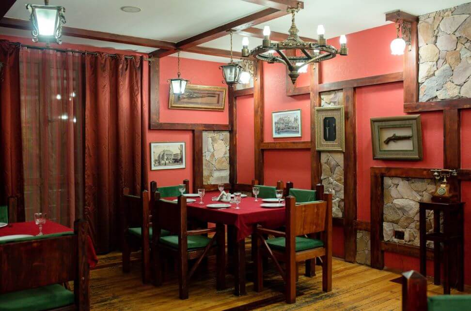
Dark Colour Palette
Colours: Crimson,purple, brown, dark green,navy
Some pubs, trendy restaurants, and taverns benefit from a dark colour scheme because it creates an intimate and romantic atmosphere. However, the room will feel small and oppressive if you use too many dark colours or hues. A dark wall colour can feel more welcoming with the addition of colourful art, flowers, plants, and lighting.
Warm Colour Palette
Colours: Yellow, orange,red, gold, terracotta,
Guests will find that spaces decorated in warm colours are engaging, cheery, and aesthetically stimulating. After being exposed to them for an extended period, these colours' high intensity might become overpowering. A high turnover rate is good for large-volume establishments such as fast-casual buffets, eateries, or fast-food restaurants. Warm colours help enhance your turnover rate and are ideal for these establishments.
Earthy Colour Palette
Colours: Brown, olive green, beige, umber, dark orange
A colour scheme that is earthy uses colours that are found naturally in the environment. These colours include various tints of brown and green and certain neutral colours. Bars, cafes, and trendy restaurants with a relaxed and welcoming vibe are ideal places to use an earthy colour scheme. Additionally, menus that emphasise natural and organic products benefit greatly from colour schemes that are predominately green and brown.
Soft Colour Palette
Colours: Sky blue, pink, light yellow, lavender, pale green
Pastels are great for bakeries, cafes, and other food establishments that cater to a more delicate palate. Due to their lightness, these colours are nearly neutral in tone, making them suitable for use with a wide range of design schemes. This colour palette has the ability to be sophisticated and modest if used properly. If you want to avoid making a space seem too childlike, try decorating with contrasting neutral colours like white, light grey, or dark wood tones.
The Connection Between Hunger & Colour Design
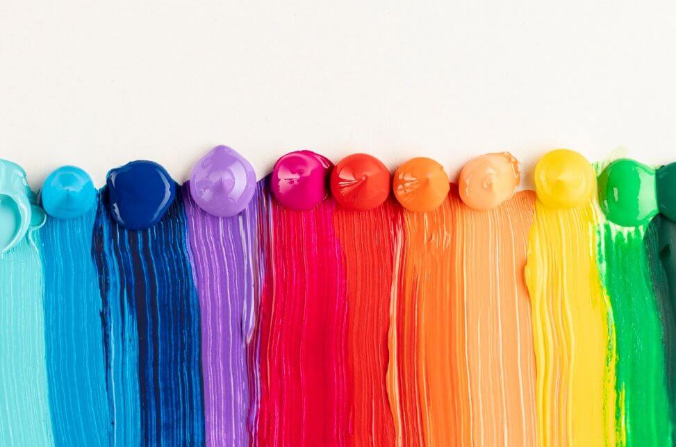
Colours can be used to either stimulate or suppress appetite. There are three broad categories for their potential to influence our hunger signals: high, medium, and low. First, we'll classify your viewpoint colour (s) according to your hunger level so we can dive deeper into the psychological meanings of colours and their effect on restaurant decor.
We also discuss the biological and evolutionary factors that may affect our reactions to and choices for each hue. To attract more of your target audience, it is essential to have a firm grasp of their unspoken expectations.
Red: High Hunger Provocation Level
Though it may harm customers' waistlines, a red tablecloth can significantly impact your restaurant's average order value. Red is the colour most commonly associated with hunger. The colour red is energising and attention-grabbing and has been shown to increase hunger. Numerous scientific studies have demonstrated that red, especially when combined with the upbeat hue of yellow, subtly encourages individuals to eat more and finish their meals more quickly. For these reasons, it's not shocking that the colour red predominates in the restaurant industry, especially in fast food chains.
There is a lot of red. Red bell peppers, tomatoes, and cherries are just some examples of brightly coloured produce that are both nutritious and high in energy. Our primal response to a fresh murder, triggered by red, dates back to our evolutionary ancestors. Looking at a vivid red object can raise our adrenaline, BP, and heart rate. In particular, vibrant reds provide a sense of enthusiasm and passion. Intimate spaces, like wine bars, can benefit from the dramatic effect of deep reds.
Orange: High Hunger Provocation Level
Orange is among the most delicious hues, along with red and yellow. Sunsets, flowers, pumpkins, and their namesake oranges are just a few of the many things we automatically think of when we see the colour orange.
Arousing the senses, just like red, are vibrant orange tones. While red and orange can elicit enthusiastic feelings, orange is warmer and more approachable than red. People often associate orange with a sense of worth and persuasion when making quick decisions.
Yellow: High Hunger Provocation Level
Hunger provocation level: High
Yellow, red, and orange are the colours most likely to make you hungry. When exposed to these hues in large doses, people not only eat more than usual, but they also eat more rapidly.
Nature abounds in shades of yellow. Yellow represents the energy that sustains life on Earth, beginning with the sun.
Visitors get a serotonin high from the bright decor. In all its variations, Yellow evokes positive emotions like joy, radiance, creativity, friendliness, and optimism. Subdued tones of yellow are more soothing and grounded. The usage of red, orange, and yellow is widespread in fast food restaurants because it motivates consumers to eat more quickly, leading to more turnover and sales.
Green: Medium Hunger Provocation Level
Green is commonly considered a moderate appetite stimulant because of its association with natural resources that keep Earth habitable. Due to the prevalence of edible plants and flora, our customers already associate the colour green with safety. As an evolutionary species, humans tend to go towards more verdant and fruitful lands when given the chance. Nature provides plenty of low-sugar, green food options.
People trying to make healthier choices will naturally be drawn to green. Light or brilliant green has a double positive effect on us since it is a soothing colour that promotes mental health and peace. Using biophilic design is another well-liked strategy for being green in the hospitality industry. Customers will perceive the presence of plants as a sign of the establishment's concern for their well-being and comfort. In fact, according to consumer psychology, having plants inside makes your business appear more expensive.
Blue: Low Hunger Provocation Level
Just as red stimulates hunger, blue stifles it. But the colour blue makes people thirsty.
The sky and the sea are two of the most iconic places where the colour blue may be found. Although berries are an exception, blue foods are uncommon.
Blue stimulates mental activity in the absence of dietary fuel. Blue has the same calming effect on the mind, body, and spirit as staring out at the ocean. Water's fresh, relaxing, and cool attributes are why the colour blue is so popular in seafood restaurants and pubs. The use of blue on the ceiling gives off an ethereal vibe.
Purple: Low Hunger Provocation Level
Purple, like blue, has appetite-reducing properties. Add touches of purple or include softer tones. However, venues at night often favour the use of vivid purple lighting. Eggplant, berries, wine, potatoes, and cabbage are just a few of the many natural foods in purple. Purple is also the colour most commonly linked to flowers, the dawn, and the dusk.
Purple, the fiery red and calm blue offspring on the colour wheel, elicits nuanced feelings because of its parentage. Due to its historically high cost and limited availability, purple dye has come to be linked with wealth and power. It's no secret that purple may do the same for your mind. The combination of neon purple and white is very stimulating.
Pastel purple is common in confectioneries because of the message it conveys of playfulness, softness, and femininity. Like dark reds, which conjure images of wine, deep purple hues look great when used to decorate bars and other opulent spaces.
Brown: Low Hunger Provocation Level
Brown is a natural appetite suppressor. However, when deep browns are linked to the delicious flavours and jolts of caffeine in coffee and chocolate, we may find ourselves longing for those products. Brown is a popular colour scheme in bars, breweries, and other upscale drinking venues like whisky bars.
Shades of brown naturally evoke a natural atmosphere, as the colour is commonly associated with nature and agriculture. Customers aren't likely to react strongly to shades of brown, but they convey a feeling of stability, earthiness, and purity. Most colour schemes work well with brown wooden parts.
Colour Schemes For Menus
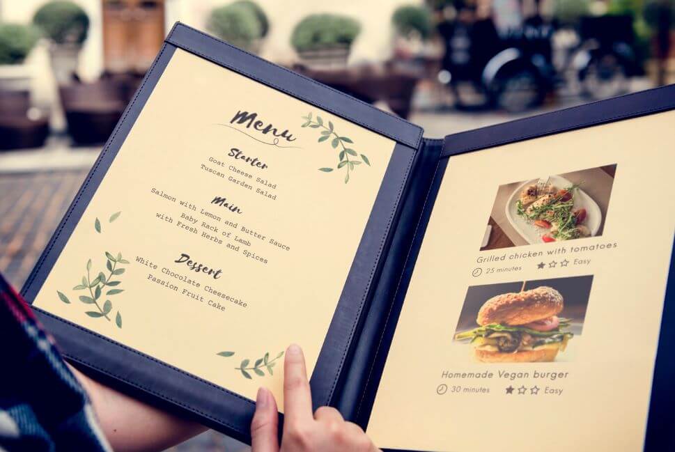
The colours on your menu are just as important as the ones in your restaurant's decor when it comes to influencing your diners. The colours you use on your restaurant's menu can significantly impact your customers' appetites and decisions. If you want your restaurant's natural feel, avoid blues and purples and prefer more lively colours like reds and oranges.
Ensure the menu colours work well together and flow with the rest of the restaurant's decor. For instance, if your restaurant's decor is heavy on earth tones like brown and dark green, you probably don't want to use many bright colours on the menu.
Conclusion
Color plays a significant role in the food and hospitality industries, as it influences the human brain's ability to eat and find food. The choice of color for a restaurant's decor should be carefully considered, considering factors such as menu design, target client cultures, and company image. Colour has far-reaching effects beyond aesthetics, influencing diners' decisions to visit, length of stay, and food ordering. A restaurant's long-term success depends on the effectiveness of the design using colour to establish an image, create ambience, and arouse customers' appetites.
Studies have shown that colours can deceive the eye into thinking a room is larger or smaller than it is, and also determine the cosiness of a room. Restaurant owners should consider their business identity and try new things when deciding on a colour scheme. The psychology of hues is crucial when choosing a colour scheme, as it can influence customers' actions after they get inside the business.
There are five color palette ideas: light, dark, warm, earthy, and soft. Light colours are ideal for formal dining establishments, while dark colours create an intimate and romantic atmosphere. Warm colours are engaging, cheery, and aesthetically stimulating, while earthy colours are suitable for relaxed and welcoming environments. Soft colours are suitable for bakeries, cafes, and other food establishments catering to a more delicate palate.
Colours can stimulate or suppress appetite, with three broad categories: high, medium, and low. Understanding the psychological meanings of colors and their effect on restaurant decor is essential to attract more of your target audience.
Red, orange, yellow, green, blue, purple, and brown are all colours that can evoke hunger in customers. Red is associated with hunger, as it is energizing and attention-grabbing, and it can increase appetite and lead to more frequent meals. Orange, on the other hand, is a warm and approachable color that evokes positive emotions like joy, radiance, creativity, friendliness, and optimism. Yellow, on the other hand, is associated with energy and is often used in fast food restaurants to motivate customers to eat more quickly. Green is considered a moderate appetite stimulant due to its association with natural resources and its association with safety. Blue, on the other hand, stimulates mental activity and has a calming effect on the mind, body, and spirit. Purple, on the other hand, has appetite-reducing properties and is often used in seafood restaurants and pubs due to its fresh, relaxing, and cool attributes. Brown, on the other hand, is a natural appetite suppressor but is often associated with the delicious flavors of coffee and chocolate. It is a popular colour scheme in bars, breweries, and other upscale drinking venues.
To ensure a natural feel, it is important to choose colors that work well with the rest of the restaurant's decor. For example, if the restaurant's decor is heavy on earth tones like brown and dark green, it may be best to avoid using many bright colours on the menu.
Content Summary:
- How do you choose the decor hues for your restaurant fit-out?
- The best way to get ready is to educate yourself on the psychology of colour and its application in the food service sector.
- Consider your business identity and try new things when deciding on a colour scheme for your restaurant.
- To attract more diners to your eatery, you must study colour psychology and learn how various colour schemes influence people.
- As a restaurant owner, you need to know how to create a pleasing colour scheme.
- The colours on the colour wheel can be grouped into three categories: strong stimulants, mild stimulants, and suppressants, which can be helpful when choosing a colour plan for a restaurant.
- Now that you know how clients respond to different colours, you can focus on choosing a colour scheme that will appeal to them.
- We compiled a list of some timeless and trendy colour schemes to help those who need more experienced decorators figure out what works.
- A few suggestions for indoor colour schemes are as follows: Light Colour Palette Colours: Ivory, light grey,pale yellow, beige, white Try painting the walls light or neutral to make a tiny space seem larger.
- Dark Colour Palette Colours: Crimson,purple, brown, dark green,navy Some pubs, trendy restaurants, and taverns benefit from a dark colour scheme because it creates an intimate and romantic atmosphere.
- However, the room will feel small and oppressive if you use too many dark colours or hues.
- Warm Colour Palette Colours: Yellow, orange,red, gold, terracotta, Guests will find that spaces decorated in warm colours are engaging, cheery, and aesthetically stimulating.
- Warm colours help enhance your turnover rate and are ideal for these establishments.
- Earthy Colour Palette Colours: Brown, olive green, beige, umber, dark orange A colour scheme that is earthy uses colours that are found naturally in the environment.
- Bars, cafes, and trendy restaurants with a relaxed and welcoming vibe are ideal places to use an earthy colour scheme.
- Colours can be used to either stimulate or suppress appetite.
- There are three broad categories for their potential to influence our hunger signals: high, medium, and low.
- We also discuss the biological and evolutionary factors that may affect our reactions to and choices for each hue.
- To attract more of your target audience, it is essential to have a firm grasp of their unspoken expectations.
- Red is the colour most commonly associated with hunger.
- The colour red is energising and attention-grabbing and has been shown to increase hunger.
- For these reasons, it's not shocking that the colour red predominates in the restaurant industry, especially in fast food chains.
- There is a lot of red.
- Orange: High Hunger Provocation Level Orange is among the most delicious hues, along with red and yellow.
- Arousing the senses, just like red, are vibrant orange tones.
- Yellow: High Hunger Provocation Level Hunger provocation level: High Yellow, red, and orange are the colours most likely to make you hungry.
- Nature abounds in shades of yellow.
- Subdued tones of yellow are more soothing and grounded.
- The usage of red, orange, and yellow is widespread in fast food restaurants because it motivates consumers to eat more quickly, leading to more turnover and sales.
- Nature provides plenty of low-sugar, green food options.
- Using biophilic design is another well-liked strategy for being green in the hospitality industry.
- But the colour blue makes people thirsty.
- The sky and the sea are two of the most iconic places where the colour blue may be found.
- Blue has the same calming effect on the mind, body, and spirit as staring out at the ocean.
- The use of blue on the ceiling gives off an ethereal vibe.
- Purple: Low Hunger Provocation Level Purple, like blue, has appetite-reducing properties.
- The combination of neon purple and white is very stimulating.
- Like dark reds, which conjure images of wine, deep purple hues look great when used to decorate bars and other opulent spaces.
- Brown is a popular colour scheme in bars, breweries, and other upscale drinking venues like whisky bars.
- Most colour schemes work well with brown wooden parts.
- The colours on your menu are just as important as the ones in your restaurant's decor when it comes to influencing your diners.
- The colours you use on your restaurant's menu can significantly impact your customers' appetites and decisions.
- Ensure the menu colours work well together and flow with the rest of the restaurant's decor.
- For instance, if your restaurant's decor is heavy on earth tones like brown and dark green, you probably don't want to use many bright colours on the menu.
Frequently Asked Questions About Restaurant Fit-Out
Red, a warm colour that dominates the food marketing industry, attracts attention. Warm colours complement each other. Hence, there's plenty of red-yellow or red-orange food branding. Health and organic foods will likely use green as the major colour, suggesting goodness, freshness and well-being.
In a nutshell, warm colours—red, orange and yellow—work best for food branding. Of these, red is the best for inciting hunger (perhaps due to the abundance of red foods in nature). And because warm colours pair nicely with each other, you see a lot of red-yellow or red-orange food branding.
Fluorescent light bulbs with a colour temperature of 3500K-4100K have a brighter, cooler white light than standard halogen light bulbs. The bright white creates a fast-paced environment that encourages customers to eat quickly and leave, which is beneficial for quick-service restaurants.
White is a top choice for many chefs for framing their culinary creations because almost every colour of food looks good in white. The colours of the food seem more vibrant, and the food looks more appealing.
Red – Appetizing: Research shows that red is eye-catching and triggers appetite. It's particularly useful in packaging design because the colour indicates ripeness or sweetness in natural foods like berries.