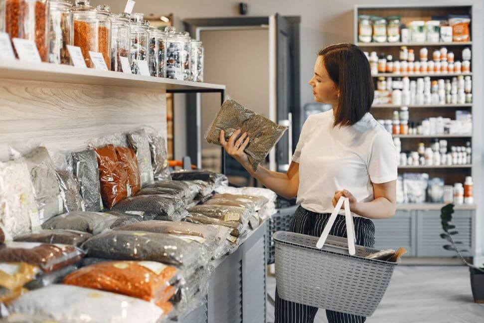
Even though e-commerce has flourished recently, brick-and-mortar establishments are still frequently visited as a tourist attraction. Yes, it is far more convenient to order things online and have them delivered to your home, but there is no substitute for browsing a store's aisles.
There may be less need for people to visit stores nowadays physically, but that doesn't imply they're obsolete.
In contrast to online resources, the knowledge and availability of store staff can be immensely beneficial and timely. Second, there are situations where waiting for a delivery is not an option and instant satisfaction is required. Thirdly, many consumers like to get a hands-on experience with a product before buying it to ensure it meets their needs.
However, this means that brick-and-mortar shops will have to work more to draw in customers than they otherwise would have. Choosing the right colours for your store's fixtures and decor is a great approach to attracting customers. In today's piece, we'll discuss the value of carefully considering your store's colour palette.
Quick Facts Regarding Colours
Some enlightening data about the prevalence of colour choices in stores:
- Colour accounts for 62% to 90% of buyers' initial perceptions of a product.
- If dissatisfied with the aesthetics, 52% of customers won't return to the store.
- Something's outward look determines 93% of purchasing decisions.
- Ads in colour are read 42% more frequently than in black and white.
- Brand identification is increased by colour by up to 80%.
- Colour improves memory by providing the brain with additional stimulation.
- Additionally, colour can reduce your operating expenses, particularly heating and cooling.
The Psychology Of Visual Marketing

Appealingly displaying products is known as "visual merchandising." All the things that make a store more appealing to customers, such as signs, displays, and lighting, fall under this category. Visual merchandising is to attract customers' eyes to specific items, boost sales through impulse purchases, and improve the overall shopping environment for the customer.
Merchandisers use colour, other visual components, marketing, and psychology to implement visual merchandising. This potent concoction can influence the customer decision-making and purchasing processes significantly.
Consider a store window aimed at chocolate. Colours like cocoa brown and opulent purple or gold could be used greatly. Customers are more likely to make a purchase on the spot if an enticing chocolatey image is shown at eye level. Colour psychology is a powerful tool for reaching and influencing your target audience.
Colour-Related Emotions
The artful application of colour theory extends beyond mere aesthetics and which hues are most likely to elicit a purchase. Rather, it appeals to the essence of human nature and substantially impacts consumer choices. When colours are used in pleasing contexts, they have a profound effect. Black with gold accents conveys luxury and exclusivity, while a palette of pastels can evoke warmth and sentimentality. Other widely used hues and their psychological associations with shoppers are:
Green
The colour green has come to symbolise natural and environmentally friendly goods for many of us. Therefore, if this is your shop's speciality, you should centre your colour scheme around various tones of green. In addition, green is the universal symbol for "go," prompting us to keep moving forward and expanding, making it the ideal hue for making snap, less-restrictive purchases.
Black
Black is a highly versatile colour; aside from the store's walls, it may serve as a background or the primary colour in the logo and marketing materials. Black is ideally reserved for marketing high-end goods like vehicles, jewels, perfumes, and electronics, as the colour connotes a sense of exclusivity and luxury. In addition, the colour helps to create a relaxing atmosphere in the store, giving customers time to contemplate their purchases.
Red
The colour red should be limited because of its association with feelings of urgency, risk, and strength rather than those of joy and happiness. Incorporating red into your colour scheme can influence customers' physiological responses, such as sweating, increased heart rate, and dilated pupils. The association with blood has commercial applications for health and well-being goods. Red's ability to evoke strong reactions makes it an ideal hue for establishments that feature cutting-edge goods.
Blue
Historically, blue has proven to be the most successful colour in bringing in new business. It also has the added benefit of putting people at ease, increasing the likelihood that they will buy anything. Stores selling expensive items with a lot at stake benefit from using blue.
Orange
Using orange, a warm and welcoming colour, will attract customers' attention and set a cheerful tone throughout your store. As a result, this may encourage buyers to make a swift purchase.
How To Pick Colours For Your Shop Displays
The brand, target market, and offers should all be considered when settling on a colour scheme and their emotional impact. Think about these things as you choose colours for your store's displays:
Intended Market
The best way to select colours for your CPG products and retail displays is to consider your target audience. Different people have different colour perceptions and preferences. Think about your ideal customer and match colours to that person's preferences, personality and identity. Consider many factors, such as:
Gender
Do you tend to get more male or female customers? Blue is the most popular favourite colour among both sexes (57% of men and 35% of women). While only 22% of men think purple is their least favourite colour, 23% of women say it's their favourite. Only 2% of men identify brown as their favourite colour, while 27% named it their least favourite, despite its frequent use for rough, manly brands.
Generally, men prefer bolder hues, while women lean towards more subdued tones. Achromatic colour palettes in various hues of grey are more acceptable to men. Also, men like darker versions of colours called "shades." Tints, or colours with white added to them, are popular among women.
Tone
Although tone is commonly associated with words, colour can have the same effect. Colours like pink, purple, orange, green, and yellow might be used by a brand that is meant to be fun. More serious brands often use traditional colours like blue, white, black, and red. Blue is associated with reliability and honesty, making it a good fit for a genuine brand.
Values
Also, consider whether your target market cares more about practicality or indulgence. For instance, 26% of individuals think orange is an inexpensive colour, and another 22% say the same about yellow. Luxury is symbolised by black and purple.
Age
Branding can also take into account the average age of your target audience. White is the colour of choice for those who are young at heart or want to project an image of being young. Baby items typically come in pastel colours like yellow since babies are drawn to it first. The colours in children's goods tend to be more vivid. Customers over 65 like blues and muted, low-contrast, similar colour schemes, whereas younger customers favour brighter, more contrasting ones.
Energy
Greys, blacks, browns, and whites are good options for a muted brand. More upbeat brands might use accent colours like lime green or cherry red.
Industry Associations
Customers' anticipation of a product's characteristics can be used to your advantage. Similar colour schemes are used by many businesses and for many products. Choosing a retail display that corresponds with consumer expectations is beneficial because consumers already have strong connections to these colours.
For instance, orange and yellow are commonly used in construction-related signage and tools. These hues look wonderful next to black type and graphics in a hardware store or workshop. Also, an orange colour scheme would benefit everything with an orange flavour. The black, grey, and white (or cyan, magenta, yellow, and kohl) colour palettes of a printer or ink cartridge display could be used well. Since blue and green are commonly linked with the freshness and cleanliness of water, they are often used as the primary colours on bottled water packaging.
Sometimes, it pays off to go against conventional wisdom. An unexpected colour choice can help your marketing stand out in a crowded marketplace. Neon green, hot pink, and traffic cone orange can pay off, even if your sector typically uses more conservative colours like red, white, black, and blue. The combination of these hues could come across as original and fresh. They can help your company get recognition as an innovative industry leader.
Brand Aesthetic
The colours you use on your display are not required to mirror those of your brand. This is especially true of holiday-themed decorations, which change their colour palette accordingly. However, the style of your brand is undoubtedly important. Black works well since it complements the colour schemes of many popular brands. If red is an element of your company's branding, you should use that exact shade of red on your display. Some companies use gold in storefront signs to emphasise the product's femininity or high-end status.
Colour's Significance In Retail Fit-Out
Here are some of the most important considerations you should make when selecting a colour scheme for your retail fit-outs:
It Tells The Tale Of Your Brand

The store's fit-out, especially the colours used, should be consistent with the brand. As discussed above, colour can boost brand recognition by as much as 80%. As a result, the colours in your shop can gently communicate with customers and shape their impression of your business. However, remember that customers may need clarification if your store's colour scheme constantly shifts, so it's best to stick to a single scheme throughout.
Gives Customers A Peaceful, Relaxed Feeling
From the moment they enter your store until the moment they depart, customers should have a positive and safe experience. You can accomplish this by employing a colour palette that conveys peace, such as the softer blues.
Product Identification And Distinction
Bright colours attract the eye. Just compare a black-and-white newspaper to a full-colour magazine. Red and orange, in particular, have a magnetic effect on the human eye. You can get more people to notice your product by using whatever bright or distinctive colour you like.
Some firms can use colour to stand out in a congested shopping aisle. If your competitors use vivid hues, selling your product in all black may help you stand out.
However, some product types tend to stick to neutral colours like black, white, and grey. Your product may sell better with a quirky colour palette with vivid hues or soft pastels. Colour is another way that brands utilise to set their wares apart from one another. Different hair and skin care product lines from the same company may come in bottles of varying colours. Shoppers can quickly sort through a brand's shampoos and conditioners by type with a colour code, such as "green" for straight hair, "red" for wavy hair, and "purple" for curly hair.
It Adds Elegance
This is a key consideration for upscale retailers who want to give off an air of sophistication and elegance. The perfect hue may transform a drugstore perfume into a high-end eau de toilette.
Draws customers' attention to specific items. Yellow, orange, and red are some of the first colours that consumers' eyes are drawn to when they're shopping. As a result, these hues are the most effective attention-getters for signs and merchandise.
Conclusion
Colour psychology has a big impact on retail sales because it changes how people first think about goods, how they remember brands, and how much they cost to run. Even though online shopping is becoming more popular, brick-and-mortar shops are still good at attracting customers.
Colour makes up between 62% and 90% of how buyers first think about a product, and if they don't like how it looks, they might not buy it again. Visual merchandising, which includes things like lights, signs, and displays, is a great way to get people to buy things and make the shopping experience better overall.
Colour psychology is more than just about looks; it affects people's decisions in big ways and speaks to their deeper selves. Green, for instance, stands for natural and eco-friendly goods, while black is flexible and great for high-end items. Red is a great colour for new products because it makes people feel like they need to act quickly and take risks. Blue has always been good at bringing in new customers because it makes people feel at ease and makes them more likely to buy right away. Orange is a nice and friendly colour that draws people in and makes them feel good, which makes them more likely to buy things right away. In a retail world that is always changing, you can attract and keep customers by carefully choosing the colours in your shop.
Think about the brand, the people you want to sell to, and the deals you have when picking colours for your store's displays. Think about things like gender, tone, values, age, industry ties, brand aesthetics, and how to identify and separate products. Both men and women like blue the most (57% of men and 35% of women), while 22% of men and 23% of women like purple better. Colour tastes can also be affected by tone. For example, guys tend to like brighter colours.
Values should be taken into account, since customers may care more about being useful or enjoying something nice. People of different ages also choose colours differently. For example, young people like white the most, while older people like colours that are brighter and stand out more. Dark colours like grey, black, brown, and white can give off energy. For happy names, accent colours like lime green or cherry red can be used.
Colour schemes that are used by a lot of businesses and goods are often influenced by industry groups. For example, orange and yellow are often used in building tools and signs, while blue and green are often used to show that water is clean and fresh. If your marketing is in a crowded market, an unusual colour choice can help it stand out.
Content Summary
- Brick-and-mortar shops remain tourist attractions despite e-commerce's rise.
- Physical stores offer unparalleled browsing experiences.
- Knowledgeable store staff can greatly enhance the shopping experience.
- Immediate purchases necessitate physical store visits.
- A store's colour palette influences customer attraction.
- Colour determines up to 90% of a product's initial impression.
- 52% of shoppers won't revisit if they dislike a store's aesthetics.
- 93% of buying decisions are based on visual appearance.
- Colourful advertisements are read 42% more often than black and white ones.
- Brand recognition boosts by up to 80% due to effective colour use.
- Colours can even impact store operating expenses.
- Visual merchandising enhances the shopping environment.
- Colour psychology is pivotal in influencing customer decisions.
- Chocolate shops can effectively use browns and opulent purples.
- Colour theory affects deep-rooted human emotions.
- Black with gold exudes luxury and exclusivity.
- Pastel palettes evoke sentiments of warmth.
- Green symbolises eco-friendly goods and encourages impulse purchases.
- Black creates an exclusive ambience suitable for high-end products.
- Red evokes strong emotional responses and is ideal for cutting-edge items.
- Blue attracts business and promotes customer ease.
- Orange establishes a cheerful store atmosphere, encouraging quick buys.
- A shop's target market influences colour choice.
- Gender preferences differ; men prefer bold shades, and women like subdued tints.
- The colour tone conveys brand energy, from fun to serious.
- Colour can indicate product value, from practicality to luxury.
- Age plays a role; younger customers favour brighter contrasts.
- Industry expectations guide colour choices, like blue for bottled water.
- Breaking the mould with unconventional colours can make brands stand out.
- Brand aesthetic and consistency remain essential in-store colour choices.
- Colour boosts brand recognition and tells its story.
- Soft blues in a store instil a sense of peace in customers.
- Vivid colours like red and orange draw immediate attention.
- Products can stand out with distinctive or contrary colour palettes.
- Neutral colours dominate some industries, but breaking the norm can pay off.
- Colour coding aids product differentiation and quick customer decisions.
- The right colour choice elevates a product's perceived value.
- Upscale retailers use specific hues for an elegant touch.
- Colours like yellow, orange, and red are potent attention-grabbers.
- The essence of a brand is echoed in its store's colour choices.
- Switching colour schemes often can confuse customers.
- A calming colour palette improves the overall customer experience.
- Bright or distinctive colours make products pop on the shelf.
- Unusual colour palettes can distinguish products in competitive markets.
- Colour codes help shoppers quickly identify products.
- Colour can redefine a product, transforming perceptions of its quality.
- Yellow, orange, and red guide shoppers towards specific merchandise.
- Colour in retail fit-out is more than just decoration; it's strategy.
- Carefully chosen colours guide customer emotions and decisions.
- The store's colour palette is an integral part of its brand narrative.
Frequently Asked Questions About Retail Fit-Out
Generally, younger shoppers are drawn more strongly to bright, bold colours, while older shoppers prefer subtle ones. If your product works best as an impulse buy, you may want to use black, royal blue, or red-orange in your display.
Every colour used in your store tells a story that will determine how shoppers perceive your merchandise. The right store colour can enhance your message and overall brand appeal. Colour psychology can lead to fewer objections to the purchase, regardless of price.
Use yellow to command your audience's attention and let them know you're confident in your abilities. Green is warm and inviting, lending customers a pleasing feeling. Second, it denotes health, environment and goodwill. Finally, green is the colour of money, creating thoughts of wealth.
As well as the emotions that individual colours can stir, the tone and brightness of colours also make a difference in consumer reactions. Warm colours, such as yellow, pink and red, produce excitement, while cool colours, such as blue and white, evoke relaxation and peacefulness.
Choose black, royal blue, or reddish-orange colours if your store is a good spot for impulse purchases. If your typical customer is budget-conscious, opt for teal and blue colours. If your ideal customers are primarily women, you can rely on blue, yellow, and orange shades. Avoid shades of green, brown, or grey.